Reflecting on my logo
Highlights from creating the foundation for my visual identity

Reflecting on my logo
Highlights from creating the foundation for my visual identity
1 logo, 2 styles
In my journey as both an artist and product designer, I wanted to refresh my logo with more depth and meaning. These were some of my initial goals when I started:
Personal: to reflect my individual aspirations and values
Professional: to connect with my product design process
Aesthetic: lighthearted, playful, and minimal (as a reminder not to take myself too seriously 😅)
Identity: monogram-ish or a typographic element to tie back to my name
Note: my entire design process from brainstorm and ideation, through final exports was done in Figma. And, actually, I was pretty surprised that I didn’t find the need to export and finish editing in Illustrator.
My previous logo
Identifying core metaphors and early visual direction
My previous logo was primarily a monogram-type logo without any key metaphors at play. For my new logo, I wanted a fusion of strong metaphors and typography.
These are some metaphors that I wanted to explore:
Process: bounce, load, grit, fail and learn, evolve (to convey my aspiration to always learn and grow)
Values: dream, vision, light, aspire (it's always important to dream and keep the larger picture in mind)
And, some aesthetics that I was inspired by:
Attributes: rounded edges, glow, geometric, gradients, 3D, text
Materials: paper, clay (I'm a builder, so gotta keep those materials handy 🛠)
So, I rolled up my sleeves and pulled up to Figma for some fun multi-session explorations where I could just tinker around.
New logo
Focusing in on the emerging traits and giving room to additional visual styling
As I was trying out those different concepts and metaphors, I started to see some directions that were more promising (and inspiring) to me.
Emerging traits:
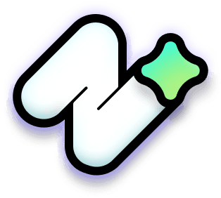
Typographic: forward-embracing, leaning “N” (this provides that typographic element, while also "leaning" into the future)
Core metaphors: shooting star represents both personal dreams and future-forward thinking during the design process (also, the star has a trajectory where it goes up, then actually falls before it bounces back up again, which is a good nod to the resilience and grit that I wanted to communicate)
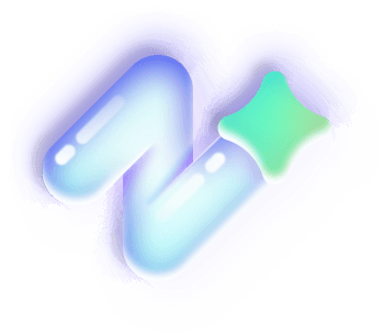
Aesthetic: simple, but not “too” abstract and adaptable to different visual treatments, since I want future opportunities to be expressive across mediums (I created many style variations along the way to test the strength of the metaphor with the visual treatments across a broad range of sizes so it works as a favicon as well as a highly detailed illustration)
Strengthening metaphor and branding with visual refinements
This is where I started to get really excited...
Through my explorations, I found a system that worked for my two core workstreams. Although they share the same process and core concepts, here are the primary metaphors for each:
Reflecting star
Nelson Rozo - product design
Yesss, I was super excited to find a metaphor that represented my personal aspirations and my professional UX strategy of always trying to be future-focused to build experiences that are impactful and thoughtful.
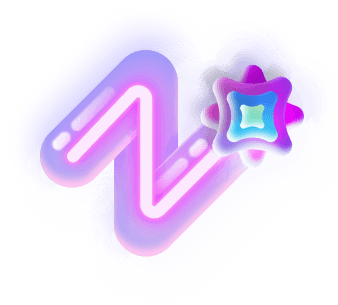
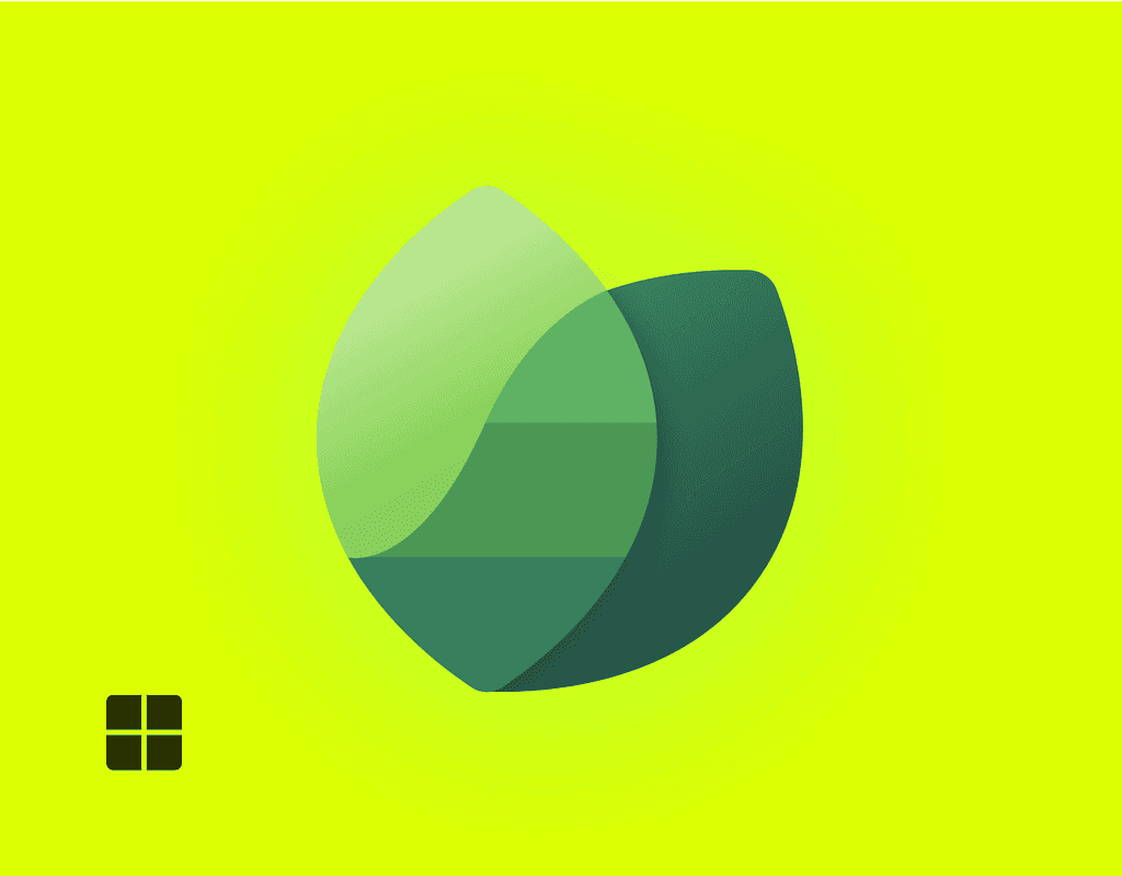
Neon rose
neon rōz - art and music
There's a lot of meaning behind the name itself (but I'll save that for another time 😄). In addition to being a nod to my after work hobbies, it fits into my goals of "trying to make the world a brighter place, one pixel at a time" through my art and music. The flower takes a slight spin (quite literally) from the star in my product design logo to create a remix on the metaphor.
You can view the logo in action at neonroz.com
Creating a visual system for illustration
Each of the logos formed the foundation for the visual direction I wanted to go. And here's an example of how the visual identity for both of these extended to my illustrations.

I hope you like them! Thanks for reading and have a great day!